Citation: Cox B, “The Power of Onboarding: Building Persuasive User Experiences for Companion Apps”. ONdrugDelivery, Issue 121 (Jun 2021), pp 56–59.
Ben Cox discusses the value of onboarding in drug delivery device companion apps, and how it is a key component of converting a one-time user to a repeat user, unlocking the true value of companion apps as a tool for combating poor adherence to medications and gathering high-quality data.
In recent years there has been a growing interest in using apps for improving adherence to medication. Smartphone ownership amongst adults in the US and parts of Europe is now approaching 90%1 and, with increased access to this technology, the number of available health apps has grown to an astonishing 370,000.2 While the covid-19 pandemic has led to a 25% surge in the number of health app downloads, up from four to five million downloads every day,3 many patients are still not using these solutions as much as they might, especially for managing chronic conditions.4
“There are a number of known challenges when it comes to health apps and apps in general. One of these is app abandonment, where around 25% of apps are used only once and then abandoned for a whole range of different reasons.”
With smartphone ownership set to increase further in the coming years, the pharmaceutical industry has been actively engaged in developing digital solutions. These include drug delivery companion apps to tackle the challenge of poor adherence to prescribed medications and to explore the huge potential of the new and better data apps can collect to improve outcomes. Some randomised controlled trials have reported promising data on adherence and clinical outcomes from app usage, however it is still difficult to draw firm conclusions regarding their impact and efficacy.5
For drug delivery companion apps to realise their full potential, and for them to begin to tackle complex issues like intentional non-adherence, it is vital that users are informed, motivated and engaged. Effective onboarding is an important step in achieving this.
THE CHALLENGES FACING HEALTH APPS
There are a number of known challenges when it comes to health apps and apps in general. One of these is app abandonment, where around 25% of apps are used only once and then abandoned for a whole range of different reasons. Health apps are also hugely variable in terms of quality, with respect to both design and content, with failings including poor information, lack of security updates and insufficient awareness of regulatory requirements.
Companion apps will be viewed on the same platforms as non-regulated consumer-facing apps, fitness trackers and social media products. Widely used apps such as these have undergone significant development over many years, using the latest user experience (UX) and user interface (UI) design trends and behavioural insights. Therefore, user expectations will be set high – a companion app with a poor UX will likely increase the chance of abandonment.
Today’s users are also likely to have other products, whether physical or digital, to manage their healthcare and to use in their day-to-day lives. However, in many cases they will have no prior experience using a digital health solution, so companion apps must work hard to demonstrate a real, tangible benefit, and encourage users to onboard and potentially opt in to sharing their data.
“Good digital onboarding often starts with an onboarding flow; a specific set of screens or UI elements that are not part of the regular app interface.”
WHY ARE COMPANION APPS NEEDED?
A key potential for medical companion apps is the ability to replicate interactions between a clinician and patient. When introducing patients to a new treatment, good communication between the clinician and the patient is key. Typically, a clinician makes a diagnosis, talks the patient through their condition and starts them off with a simple first step. Check-in appointments may be arranged where the clinician can adapt the treatment and give extra tasks to the patient. This method is normally quite effective, albeit time-consuming for everyone involved.
In other circumstances, in the interests of saving time and costs, a clinician may “front-load” a lot of information onto the patient, possibly in a group setting with other patients. In this situation a patient may be overwhelmed and not understand the purpose of a particular therapy or the implications of failing to adhere to a treatment regime.
Using a companion app to manage a patient’s condition can offer an alternative, less time-consuming means of communicating key information about their treatment to them. Following a consultation with a clinician, a patient may be given some initial guidance before using the app for the first time. The app will then typically take them through a set of introductory steps to guide them into the treatment, called an “onboarding flow”. These initial steps can be a crucial cut-off point for users, therefore it’s important to get them right.
THE POWER OF ONBOARDING
So, what is onboarding and why is it important? Aside from management jargon, it is a term widely used in digital UX design and represents one of the most important parts of a user journey for any digital product. It provides a crucial opportunity to inform and motivate users to adopt a new product or platform.
Imagine someone boarding a cruise ship for the first time. This experience can be very similar to onboarding with an app. Passengers are often a little disoriented when they board the ship; maybe they’ve never been on a cruise ship before, they’re unaware of where to go, how to get settled in and how they’re supposed to interact with other passengers. The ship’s crew welcome passengers and get them settled in a way that makes them both comfortable and instantly knowledgeable about key aspects of the ship. The same applies to onboarding in a companion app. Users need to feel confident and assured in taking their first steps with a new treatment, with ready access to the essential information they need to get started in the way they want, but without being overwhelmed.
So how do you build an optimal onboarding experience for companion apps?
Delivery Device Packaging
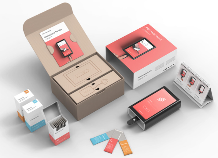
Packaging and print make up some of the first steps in the user journey when starting out with a new drug delivery device (Figure 1). It is important to consider the whole UX and UI of the system in terms of opportunities to influence behaviour, with packaging and print serving to provide key information and education, reduce anxiety and guide users towards a successful digital onboarding experience.

Figure 1: Packaging is the first point of contact of a product with a user, and so is an important aspect of the onboarding process.
One of the obvious initial barriers to adopting a companion app is access – a user needs to be introduced to your app before they can reap the benefits. The drug delivery device’s packaging provides a good opportunity to help users understand that a companion app is available to them, how to access and download the app, and how it can help in their treatment. If the device needs to be connected, packaging and print can also be used to start the process of guiding set-up steps.
Onboarding Flows
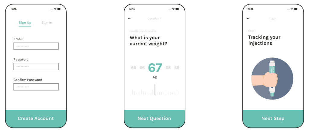
One key consideration when thinking about onboarding is not showing too much of the system up-front before a user becomes familiar, and engaged, with its use. Good digital onboarding often starts with an onboarding flow; a specific set of screens or UI elements that are not part of the regular app interface. Onboarding flows can be particularly useful for drug delivery companion apps due to the following components (Figure 2):
- Personal information will typically be required, therefore users will be expected to create an account and confirm their identity to view and manage their data.
- The app functionality is likely to be tailored to the user’s context and goals. A brief survey or questionnaire may be required to capture lifestyle information, pre-existing conditions or health history.
- Important app features or workflows that may be unique to the app should be highlighted, especially for connected drug delivery devices that may be completely new to users.

Figure 2: Onboarding flow components.
“The goal is to help a new user become a repeat user as smoothly and as quickly as possible, so that they become less reliant on external triggers and more on internal triggers, and start to build habits and adopt the product as part of their routine.”
Persuasive Design
Designing a good onboarding flow requires a combination of good UX design practice, coupled with authentic and approachable information to educate and motivate users. Communicating effectively and using persuasive design principles helps to ensure users feel confident and informed. In the context of companion apps for drug delivery, persuasive design is not about trickery or improper influencing; if applied carefully and ethically, with the interests of the user at heart, persuasion can help to gain a user’s trust and focus their attention and effort towards specific topics and goals. Key concepts in persuasive design include:
- “Tunnelling” is a pattern to support easy and efficient onboarding, using a predetermined sequence of steps to encourage a certain outcome, with the focus on one task or goal rather than many during an onboarding flow.
- “Tailoring” can help an experience feel more personal and is key to customising app functionality to a user’s context and goals.
- “Social proof” helps to encourage adoption and acceptance where users see evidence that other people in a similar situation to their own are benefiting from the use of the product or service.
- “Chunking” is the practice of breaking down information into small, memorable parts and can be used to avoid overloading users with feature descriptions.
Data Privacy
When asking users to sign up to a new companion app, privacy concerns must be addressed at the earliest opportunity. A recent study in the US found that the majority of Americans believe that data collection poses more risks than benefits.6 The simple communication of privacy controls and justification for entering personal information should be included in sign-up or onboarding screens.
External Triggers
The final part of the equation for onboarding and the early stages of adoption is the use of external triggers to prompt behaviour. These may include prompts and reminders, pop-ups or tooltips highlighting new features, or message notifications from the app community or healthcare provider. The key is to use these sparingly to avoid fatigue. The goal is to help a new user become a repeat user as smoothly and as quickly as possible, so that they become less reliant on external triggers and more on internal triggers, and start to build habits and adopt the product as part of their routine.
When compared with popular consumer apps where a user’s objective can be achieved by completing a few simple tasks, such as purchasing an item, companion apps for drug delivery devices are intended to address issues that can take months or years to manage. Therefore, onboarding must be carefully considered. It is the front line of a user’s experience and everything from adoption, engagement and retention can be positively impacted.
APPS FOR HUMANS

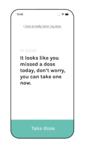
Figure 3: Example of a friendly app persona.
Human conversation is about exchanging meaning in ways that make sense in a current situation. In many scenarios, companion apps augment the role of a carer or clinician, effectively “talking” to the user. Designers should listen to what users say and take account of the type and tone of conversation they may wish to have with a companion app, even for screen-based UI. Both system and user personas should be considered to ensure a consistent, authentic and approachable experience (Figure 3).
Looking at emerging design systems from Amazon and Google for voice and multimodal UI, now is the time to start shifting our thinking around the systems and situations we already design for; modelling human interactions as a way to develop more compelling and individualised digital interfaces and interactions. Designers should focus on creating more personal experiences and avoiding robotic or sterile interactions.
THE FUTURE OF DIGITAL HEALTH
There is significant work underway to develop new health apps, build an evidence base, validate functionality, create standards for development and design frameworks for app evaluations. As a result of covid-19, health has been brought to the forefront of many people’s minds. In light of this, there have been reports of a rise in patient adherence, with many people looking to ensure they remain fit and healthy. This is partly due to the limited in-person access to GPs and hospitals over the past year, leading many people to look into tools for self-managing their conditions and taking their existing medication more seriously. As the pharmaceutical industry continues to explore digital solutions such as companion apps to capitalise on this trend, building effective onboarding and persuasive user experiences will be an important step towards ensuring their adoption.
REFERENCES
- Klienman Z, “Most healthcare apps not up to NHS standards”. BBC News, Feb 2021.
- O’Dea S, “Smartphone users by country worldwide 2021”. Statista, Jun 2021.
- “COVID-19: Digital Health Trends Report”. ORCHA, Sept 2020.
- Gordon WJ et al, “Beyond validation: getting health apps into clinical practice”. npj Digital Medicine, 2020, Vol 3, Article 14.
- Ng R, Carter SR, El-Den S, “The impact of mobile applications on medication adherence: a systematic review”. Transl Behav Med, 2020, Vol 10(6), pp 1419–1435.
- Auxier B et al, “Americans and Privacy: Concerned, Confused and Feeling Lack of Control Over Their Personal Information”. Pew Research Center, Nov 2019.

